EPIC.Track: tracking environmental assessments against statutory deadlines
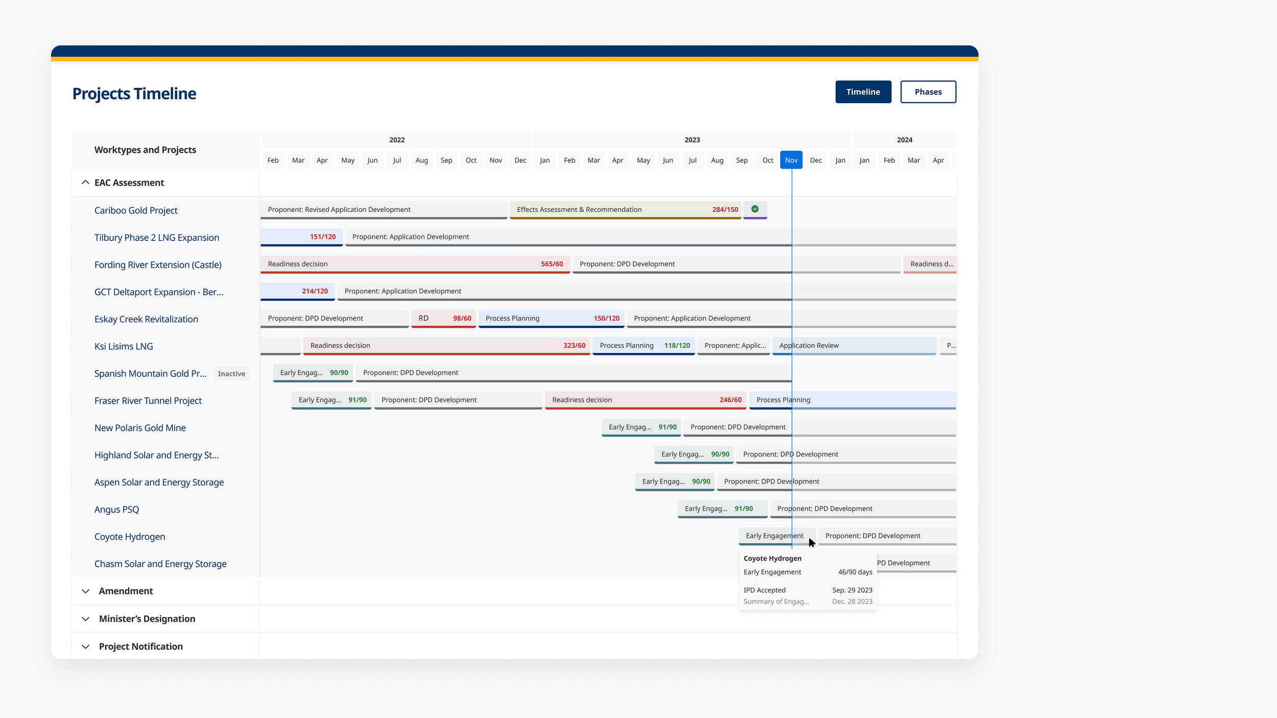
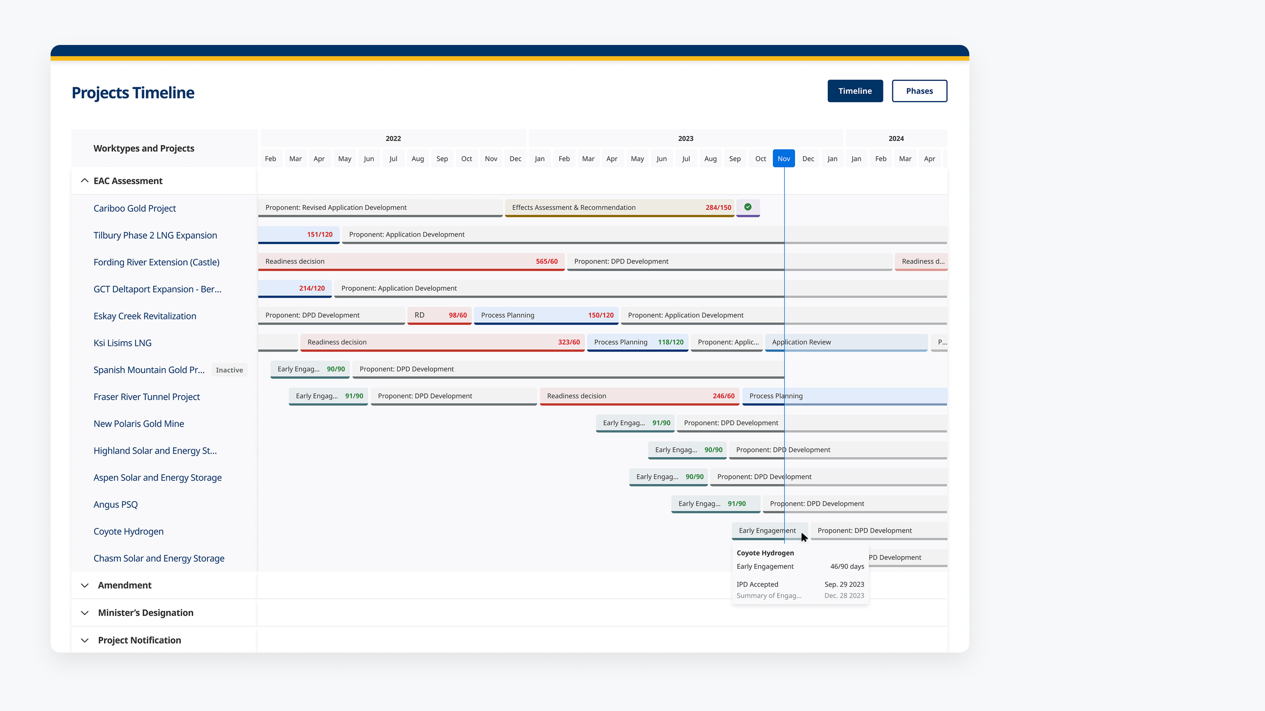
The Projects Timeline: per-phase bars against a monthly axis, with days used shown against days allowed.
MY ROLE:
UX Designer, led design and usability evaluation
TIMELINE:
April 2023 – January 2024
TEAM SETUP:
UX Designer, Product Owner, Software Engineers
METHODS USED:
Legislated process mapping · Data-visualization design · Low- and high-fidelity design · Task-based usability testing (severity scoring, time-on-task with confidence intervals, top-box analysis) · User stories and acceptance criteria
The problem
Six phases, tracked in spreadsheets
Every major project runs through the same six phases, and each phase has a statutory time limit. Before EPIC.Track, each project's progress was recorded in an Excel workplan of roughly ninety rows. The workplan covered the EA clock day count, whether each step was internal or external, the approval chain running from officer up to the Chief Executive Assessment Officer, and Indigenous nations' participation and capacity funding.
Because the records were held one file per project, there was no view across the portfolio. Answering a question such as which deadlines were at risk meant opening files individually and comparing them by hand.
Six legislated phases, each with a time limit set in law. Before EPIC.Track, these were tracked in a spreadsheet of roughly 90 rows, one per project.
Mapping the legislated process
I mapped the assessment end to end as a four-lane service blueprint covering the office, the proponent, other ministries and stakeholders. This translated the notification, referral, order and decision points set out in the Act into events the system could track.
I also recorded the questions the process itself did not resolve: when tracking formally starts, how the office learns that a submission has arrived, and how joint federal and provincial reviews affect who is responsible for tracking. These were raised with the business as open questions rather than resolved within the design.
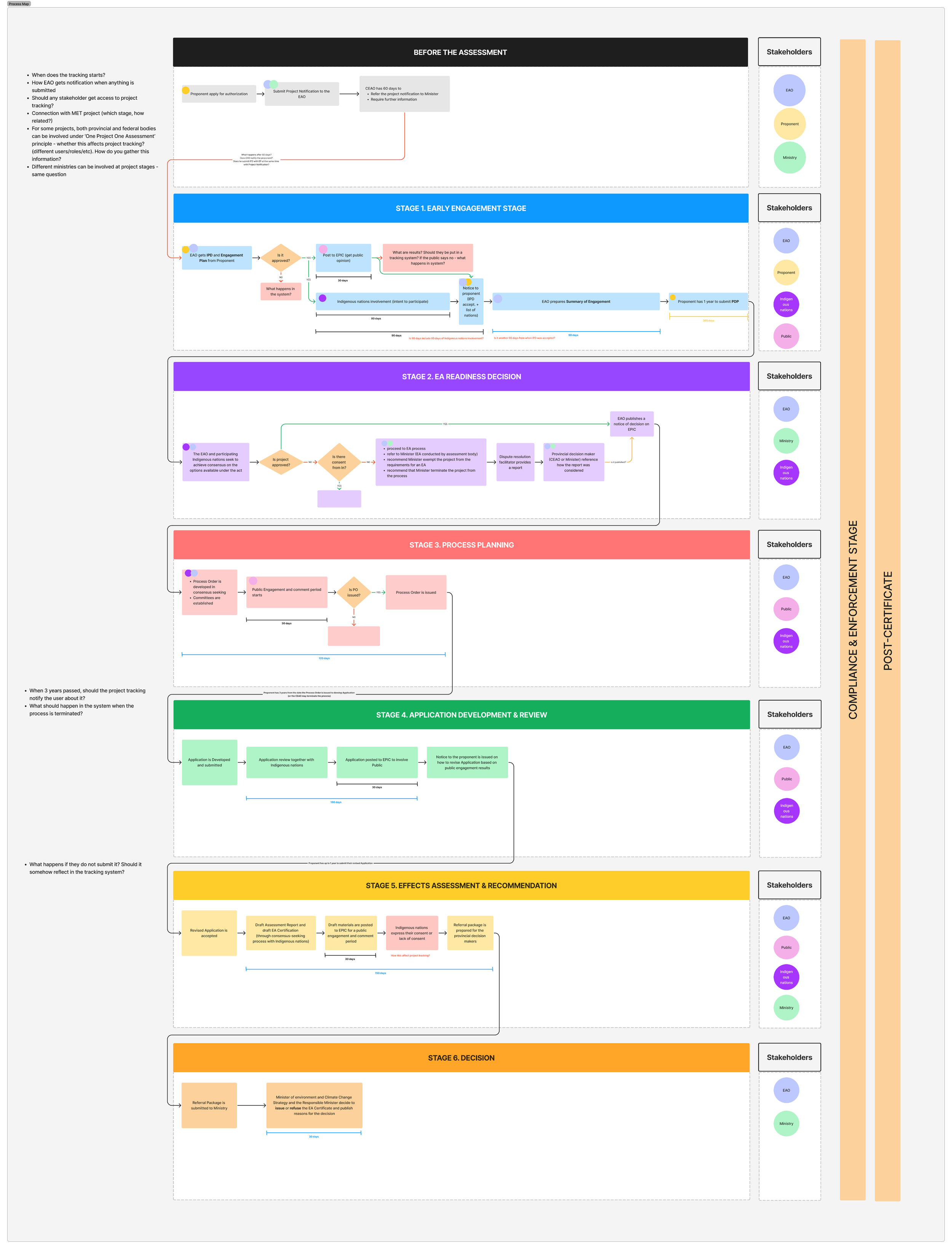
The legislated process across four lanes, with unresolved questions recorded in the margin.
The views
The problem was not storing the dates. It was making a project's position against its deadline readable without calculation.
A Gantt-style Projects Timeline with a monthly axis, per-phase bars, statutory deadline badges and hover detail, showing all projects on one screen.
Days used against days allowed, shown on each phase, so a project at 284 days against a 150-day limit is visible without working it out.
A Phases board showing progress across the six phases, with schedule overages flagged.
Dashboard, Reports and Insights views presenting the same data at different levels: an individual's own workload, all work across the office, and analysis across projects.
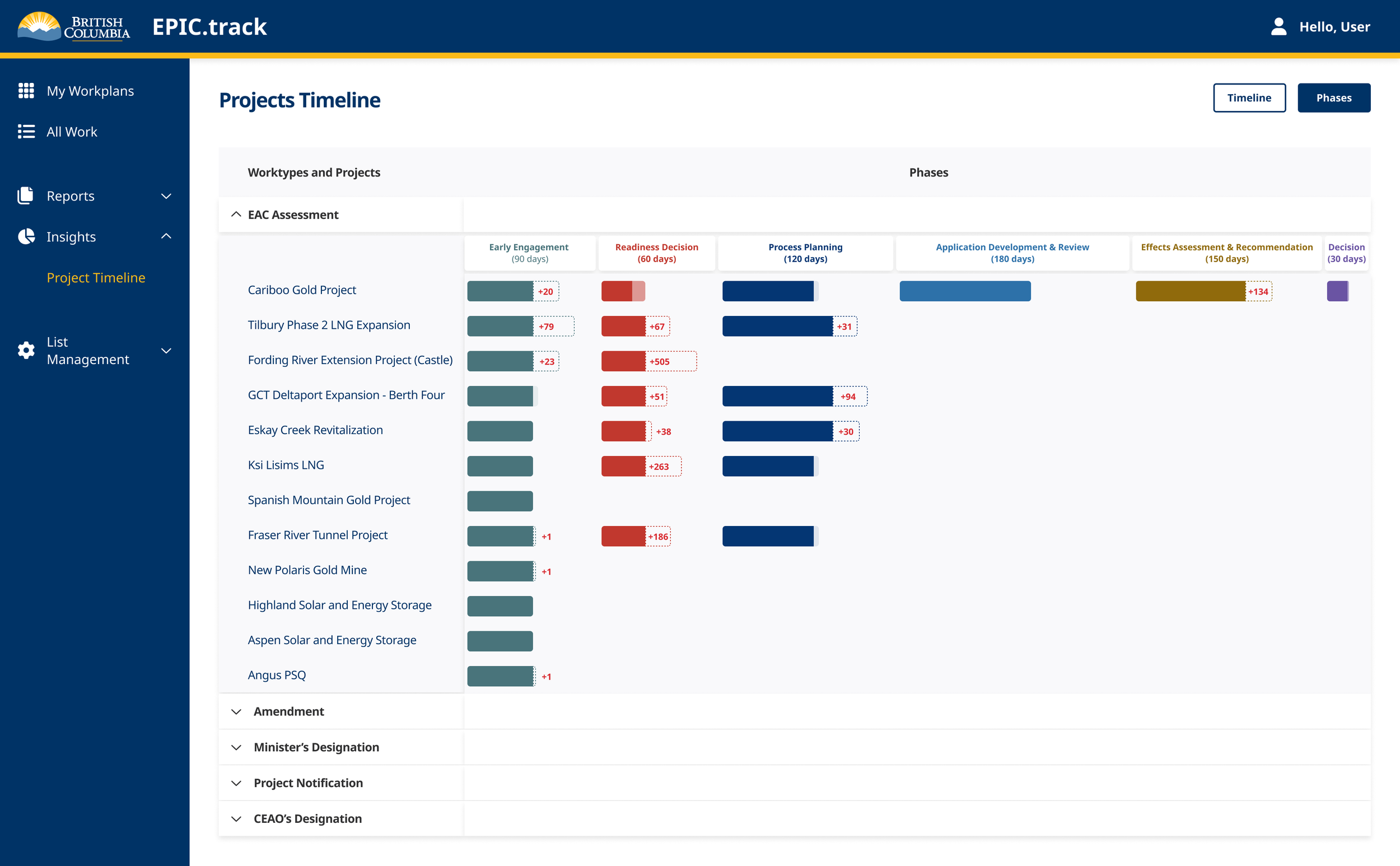
The Phases view: progress across the six legislated phases, with overages flagged.
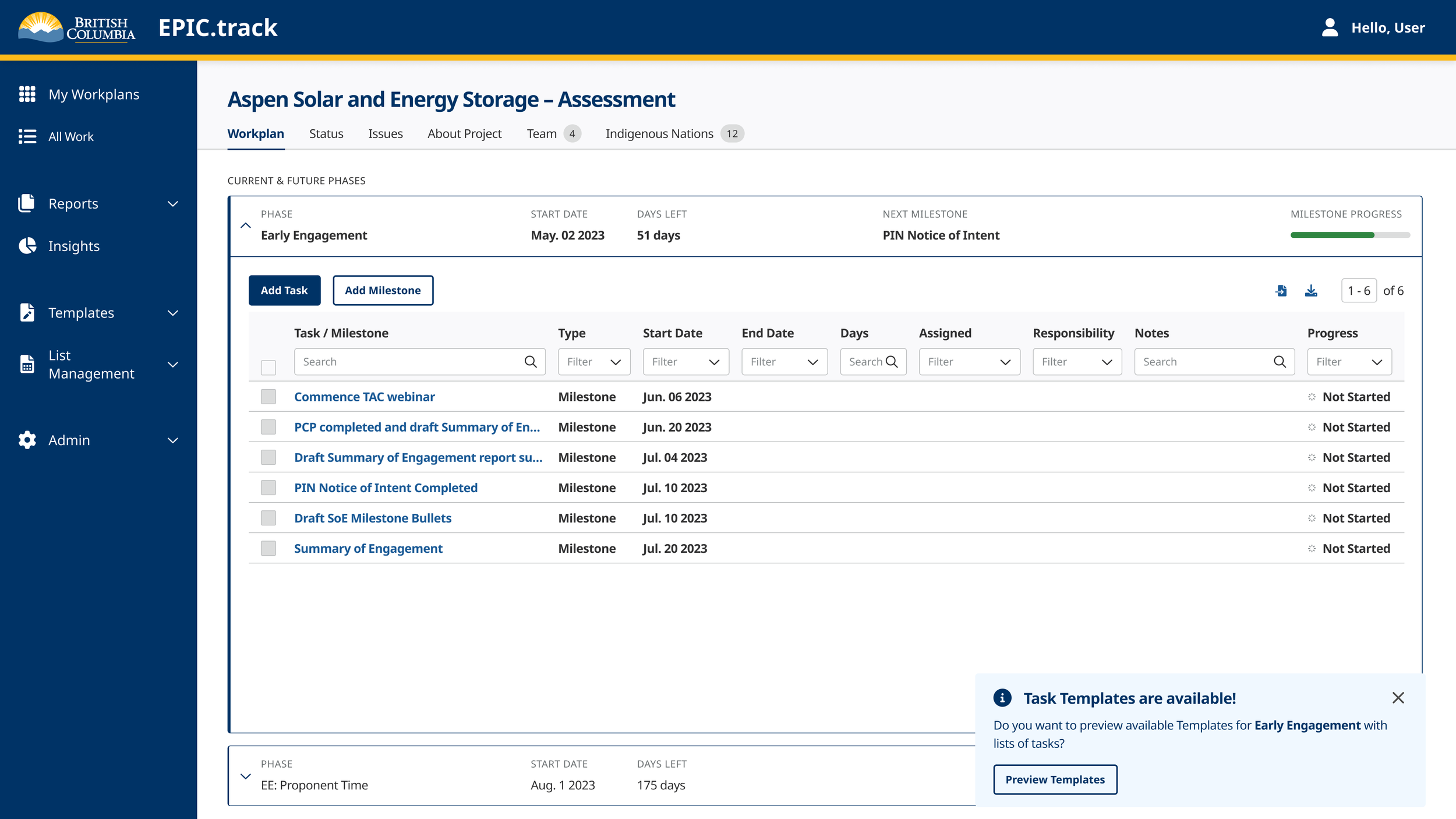
Expanded phase detail and the actions available within it.
Where the tasks came from
Before designing the study I ran a planning session with the product and delivery team, structured around one question: what are we afraid of. The team listed the risks it saw in the system going live, and each risk was turned into something the study could observe.
This is what the eight task scenarios were built from. It also meant the results could be reported back against a concern someone in the room had already raised, rather than as a list of usability problems with no owner.
Summarised from a planning session with the product and delivery team. Six of the risks raised, and the study goals they produced.
How the study was run
Ten of the thirteen people who would use the tool took part, which is close to the full population rather than a sample. Participants were stratified across four role types and tenure ranging from under a year to eight years.
The study used eight task scenarios based on real work. Time on task is reported with 90% confidence intervals, because with ten participants a mean on its own gives little indication of spread. The post-test questionnaire was analysed by top-box rather than by average, since an average can conceal how many people found a task genuinely easy.
Each task was scored against a rubric written before testing began. Every participant's behaviour on every task was recorded against the same structure, and the severity scores were derived from those records.
The study ran against real project records in a test environment, so the screens here are blurred and participants are identified only by number.
Written before testing began, per task, in observable behavioural terms. Defining the levels in advance means the criteria cannot be adjusted once the results are known.
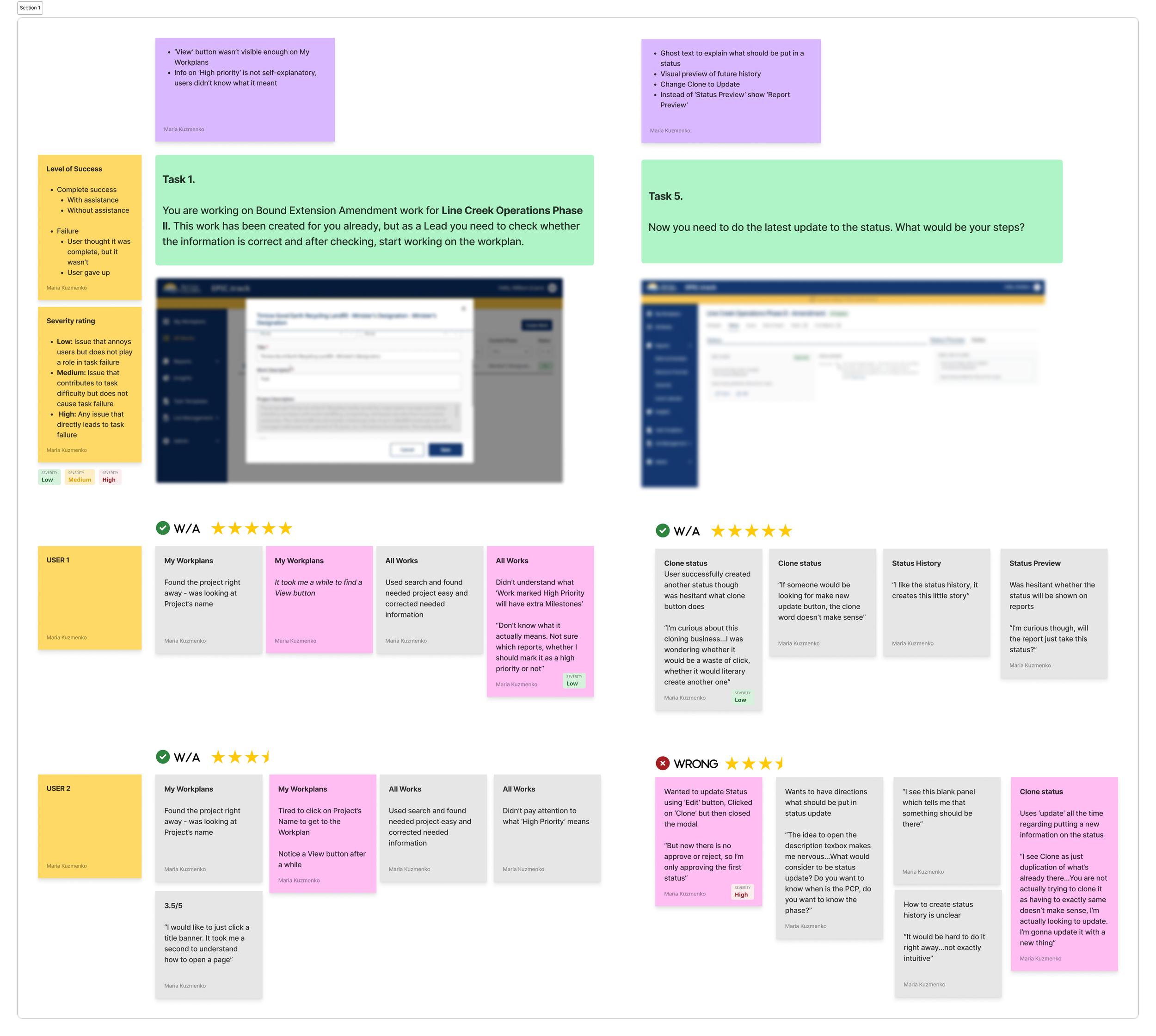
Two tasks from the usability study: the scenario, the screen it applied to, and each participant's observations against it. Application screens are blurred because the study ran against real project records.
Results
The post-test questionnaire results are below. One task in the study performed differently from the others.
“This will help me get rid of at least 6 different Excel spreadsheets out of 10.”Study participant
Post-test questionnaire, share answering 6 or 7 on a 7-point scale.
The task that failed
Task 1 asked participants three questions about the dashboard in front of them. Do you know what Work you have been assigned to? What type of Work are those projects in? How many different Work items can you see?
It took substantially longer than any other task in the study and produced the highest number of failures.
Time on task, in seconds
Bars show the mean; the vertical line is the 90% confidence interval.
Task 1 took 254 seconds, against 23 to 99 for every other task in the study.
How the ten participants did on that task
No problem 1 Minor 0 Major 5 Failure 4
What was actually going wrong
The interaction was two clicks. The time was not spent navigating. It was spent trying to work out what the words meant.
Work was a new concept the product owner had introduced to describe a unit of assessment activity. Participants did not know what counted as Work, how a workplan related to it, or what a work title was. Without that model they could not answer the question, however the screen was arranged.
This was a shared-language problem rather than a layout problem, and it was not fixable by moving elements on the dashboard. The product owner ran lunch and learn sessions to explain the model to staff.
What I took from it
The measurement told me where the problem was. It did not tell me what the problem was. On the numbers alone, a task that slow with that many failures reads as an information structure that needs rebuilding, and that is the recommendation I would have made from a dashboard of results.
What showed it was a vocabulary problem was sitting in the sessions and listening to people talk through the screen. That is the argument for moderated testing over an unmoderated metric. The metric is what makes the problem impossible to ignore; the session is what stops you fixing the wrong thing.
The second thing I would change is how I presented it. I reported in the units of the study, seconds and severity ratings and confidence intervals. Those are the right units for judging whether a finding is reliable, but they were not the units the decision was being weighed in. Nine failures out of ten is a training and support cost, and in this case that is exactly what it became.
Outcome
EPIC.Track went into service and replaced the per-project spreadsheets it was built to retire.
It has since become the office's source of truth for project records. Rather than holding their own copies of project metadata, other applications now pull it from EPIC.Track: EPIC.Compliance for compliance and enforcement case files, EPIC.submit for proponent document submissions, and EPIC.Map for spatial data.
That has a measurable effect downstream. On EPIC.Compliance, pulling project details from EPIC.Track when a case file is opened removed the need for officers to key them in or check them against another system, and errors found at deputy review in those fields fell from 2.0 to 1.5.
The work predates my AI-assisted practice. This was 2023 and 2024, and the design and analysis were carried out without AI tools.
The methods used here are the ones I have carried into later projects: a rubric written before testing, confidence intervals on small samples, top-box analysis rather than averages, and reporting the task that failed alongside the ones that worked.