Thumbnail — EPIC.map.png

EPIC.Map – An AI-Built Geospatial Prototype for Environmental Assessment


EPIC.Map – An AI-Built Geospatial Prototype for Environmental Assessment

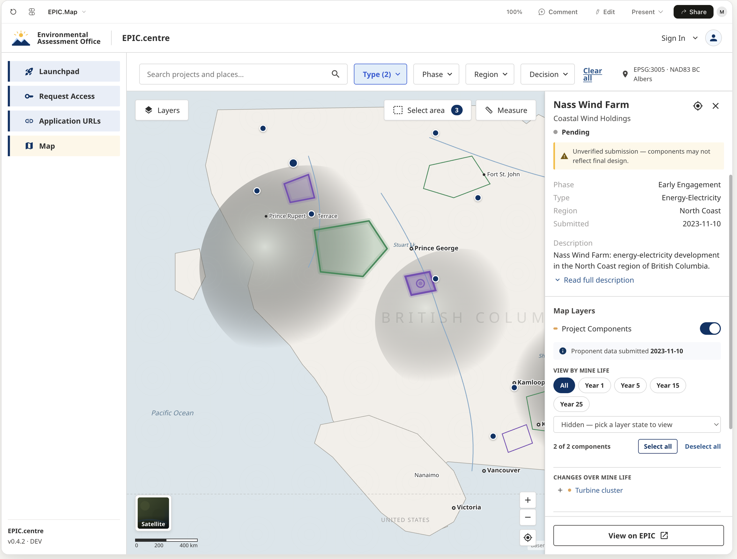
Project shown as a single point beside the same project shown as a real footprint with components

Project material shown is published publicly by the Environmental Assessment Office at engage.eao.gov.bc.ca.

MY ROLE:

Senior end-to-end product designer

TIMELINE:

Nov 2025 - Present

TEAM SETUP:

Software Engineers, GIS specialists, Scrum Master

METHODS USED:

Domain analysis · Discovery interviews · Survey design and analysis · Affinity mapping · Personas and job stories · Geospatial data analysis · Information architecture · AI-assisted synthesis and prototyping · Moderated usability sessions · Options and trade-off analysis

British Columbia's Environmental Assessment Office assesses major projects: mines, transmission lines, solar, access infrastructure. Until now, staff saw each project on a map as a single latitude-and-longitude dot.

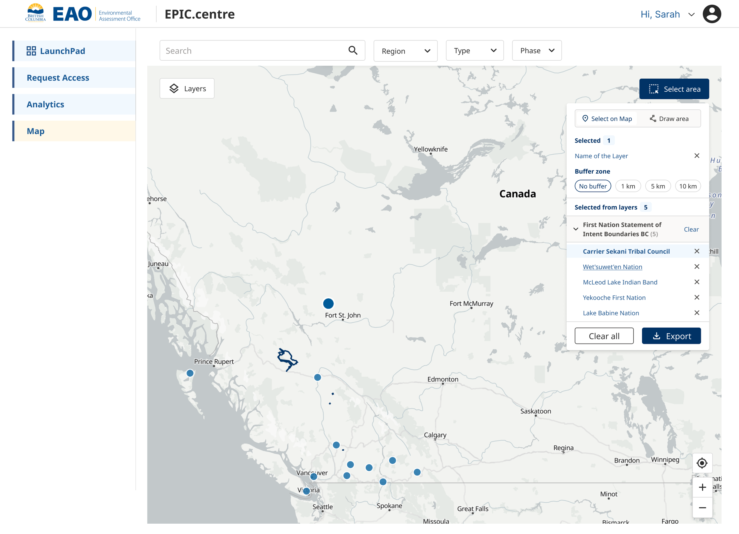
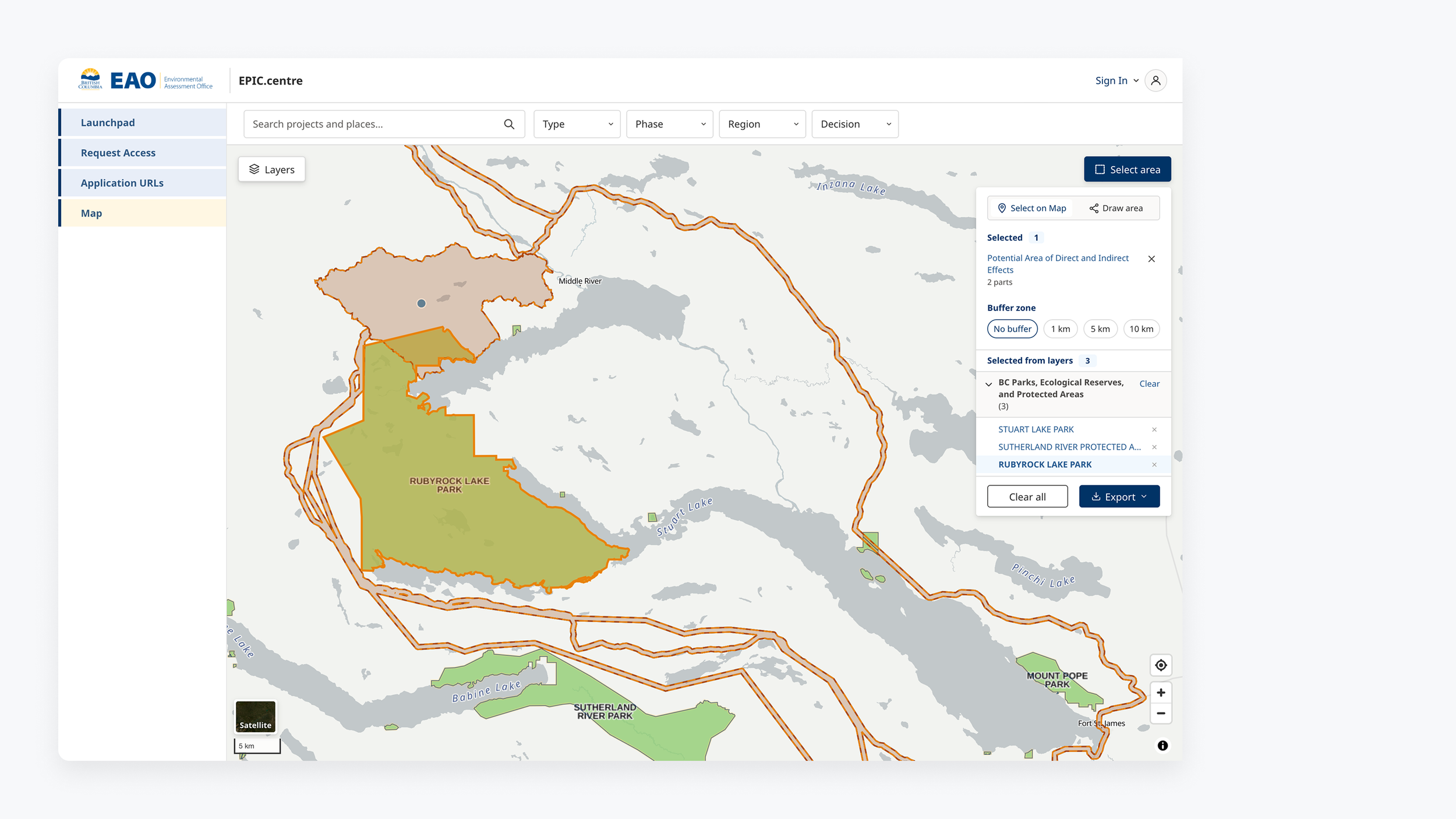
EPIC.Map shows the project's actual footprint and its components, overlays provincial data, and lets staff ask what intersects or surrounds a project area.

Screens on this page are redacted. This project handles confidential and proprietary data, including data that requires specific training to access.

Video walkthrough: EPIC.Map prototype

This 2-minute walkthrough shows the working prototype. It was built with AI on the back of the discovery interviews, before any development had started, and went out to staff alongside the survey so people could react to something real rather than to a description. It shows:

  • Searching for a place or a project, then seeing the actual footprint and the components inside it instead of a single point

  • Adding any BC provincial layer, with opacity control and saved favourites that persist between sessions

  • Selecting an area and running a query that returns everything inside it, across every layer switched on

  • Exporting the result to PNG or PDF, and uploading your own layers when what you need is not already published

The video was part of the research, not a demo of a finished thing. Because the prototype was AI-built, staff could respond to working functionality before any production code existed, and both the survey responses and the testing volunteers came from people who had already used it.

Prototype walkthrough, sent to staff alongside the survey

The problem

Three tools, none of them the job
Staff answered spatial questions by stitching together three things: the province's iMap, a set of custom maps built on request by the office's GIS specialist, and Google Earth. Then they screenshotted the result.

The custom maps were genuinely useful, but they were made one at a time, for one request, and deleted over time. Anything beyond them meant another request and another wait. Nobody could see a project's real shape without asking someone else to make it visible.

iMap

The province’s map viewer. Where staff went first, and where most of them got stuck.

“iMap will often crash. It can’t handle the full project layer.”

“Sometimes it can’t pull up the data that I want. It really struggles when there is a lot of data.”

“Those are protected layers, you need permission to look at them.”

Custom maps

Built one at a time on request by the office’s GIS specialist. Useful, but temporary.

“It can be really overwhelming. And the colours.”

“It’d be nice to draw a polygon and then you just get those results, versus having to wade through.”

Google Earth

The fallback for anything the other two could not answer.

“You need to really zoom in if you want to find some of these very obscure places.”

“I just find this search bar super helpful, because I can just type.”

“You kind of put them together and sort of figure it out.”Regional engagement lead, on working across all three

Learning the domain

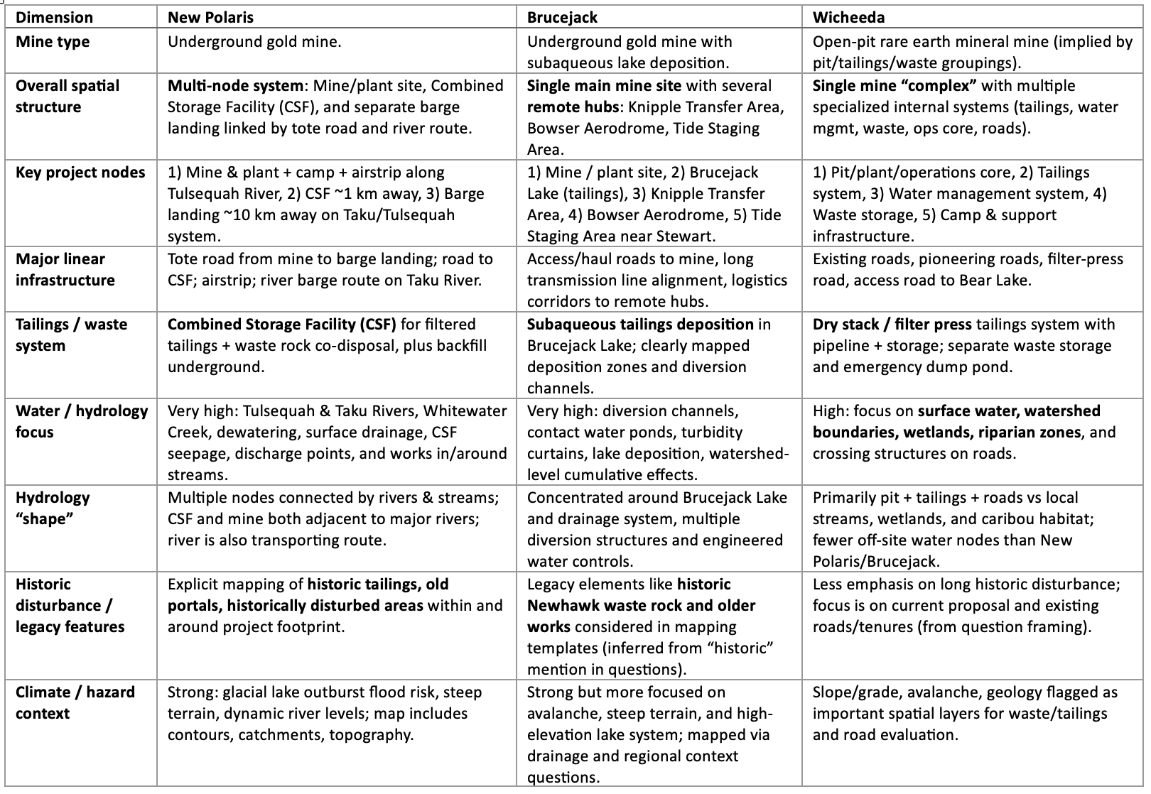
Before interviewing people who work on mines, solar and other project types, I needed to understand how those projects differ spatially. A gold mine and a rare-earth mine do not have the same shape on a map, and neither looks like a solar project.

I used AI to work through the public documentation for several project types and compare them on the dimensions that would matter in an interview: overall spatial structure, key project nodes, linear infrastructure, tailings and waste systems, water and hydrology.

It meant I arrived able to ask specific questions, instead of spending the first twenty minutes of a busy expert's time being taught the basics.

Table comparing spatial structure across three mine types

One type of projects (mines) analysis example

Fourteen interviews, four groups

The spread was deliberate. I wanted to know whether these groups actually needed different things, or whether we only assumed they did.

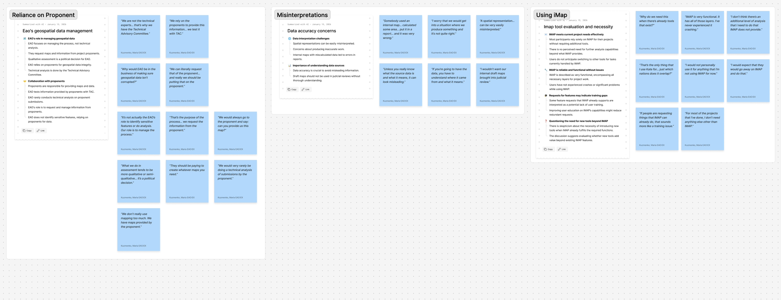
I synthesised the transcripts with AI assistance and checked every finding back against the source before it informed a decision. Anything I could not trace to a transcript stayed labelled an assumption.

The nine capabilities the survey went on to test came out of those interviews, so the survey was checking a hypothesis rather than collecting a wish list. It went out with the video walkthrough of the prototype, which meant people were reacting to something they could see working rather than to a description of a feature. Thirty-two people responded.

One finding shaped everything after it.

14in-depth interviews
4distinct user groups
32survey responses
9moderated sessions
The finding that shaped everything after

Mapping needs differ by phase, responsibility and risk tolerance. Not by preference, and not by technical skill.

Affinity map clustering interview findings by role

Three groups, three different questions

What mattered as much as defining what each group needed was defining what the map was not for. In a regulated office, a tool that looks like it produces authoritative spatial conclusions is a liability, not a feature.

Primary

Regional engagement leads

Who may be affected, and why?

How they use maps

  • Early scoping, before conversations begin
  • Component-specific consultation
  • Orientation against territorial context
  • Sense-making alongside First Nations

Risk if unsupported

  • Missed overlaps
  • Inconsistent consultation scoping
  • Reliance on memory and screenshots

Not what the map is for

  • Determining duty to consult
  • Performing effects assessment
  • Producing authoritative spatial conclusions
Primary

Compliance and enforcement officers

Did this happen where it was allowed?

How they use maps

  • Locating conditions in space
  • Verifying inside or outside an approved footprint
  • Documenting inspections without ambiguity
  • Working at boundaries and buffers

Risk if unsupported

  • Ambiguous inspections
  • Inconsistent enforcement
  • Legal exposure

Not what the map is for

  • Determining consultation scope
  • Predicting cumulative effects
  • Producing new spatial analysis
Secondary

Project directors

What surrounds this project, and what will I be asked?

How they use maps

  • Early orientation on a new file
  • Sanity-checking spatial claims
  • Preparing for public and political moments
  • Onboarding staff onto a project

Risk if unsupported

  • Caught off guard by predictable questions
  • Context that lives only in experienced heads

Not what the map is for

  • Doing spatial analysis internally
  • Taking on GIS governance
  • Creating outputs mistaken as authoritative

The boundary mattered as much as the need. Every project director I spoke to engaged in spatial sense-making constantly, and every one of them resisted a tool that would make them accountable for spatial analysis. That resistance is principled, political and legal, not obstructive. Designing around it was the job.

Three options, and a decision that was not mine to make

The research produced validated needs across three groups, against limited development capacity and real governance constraints. Proposing a build would have been the easy move and the wrong one.

Instead I put three options to stakeholders with the trade-offs made explicit, and gave each one a condition under which it would be the right choice. That way the decision could turn on capacity and appetite, rather than on who argued hardest in the room.

 Option 1
Data and capability first
Option 2
Internal map (MVP)
Option 3
Compliance-focused map
New productNoYes, internalYes, specialised
Development capacityLow to moderateModerateModerate to high
Governance complexityLowMediumHigh
Legal and reputational riskLowMediumMedium to high
“Mini-iMap” perception riskNoneMediumLow
Addresses validated painMediumHigh, engagement leadsHigh, compliance
Best fit if…Development capacity is constrained and the priority is foundational improvementCapacity exists, there is appetite to address workflow pain, and scope stays tightly controlledCompliance workflows are the priority and leadership wants to explore cross-agency value

Scroll the table sideways on a narrow screen.

When the ground moved

Partway through, one of the two primary user groups became unavailable to work with closely. The option built around them was no longer viable.

Rather than carrying it as a hypothetical, I closed it and rebuilt the proposal around the internal map for early assessment: what it should focus on, what it should deliberately leave alone, and the constraints that direction brought with it. Choosing the option that served the widest set of users within the capacity available was the honest answer, even though it was not the most ambitious one on the table.

Building it, and holding AI to a design system

I built a functional, interactive prototype rather than a click-through, so real features could go in front of users early without spending developer time first.

The part that made the output usable was grounding the tools in what already existed. Generated designs are only worth having if they match the system you already run.

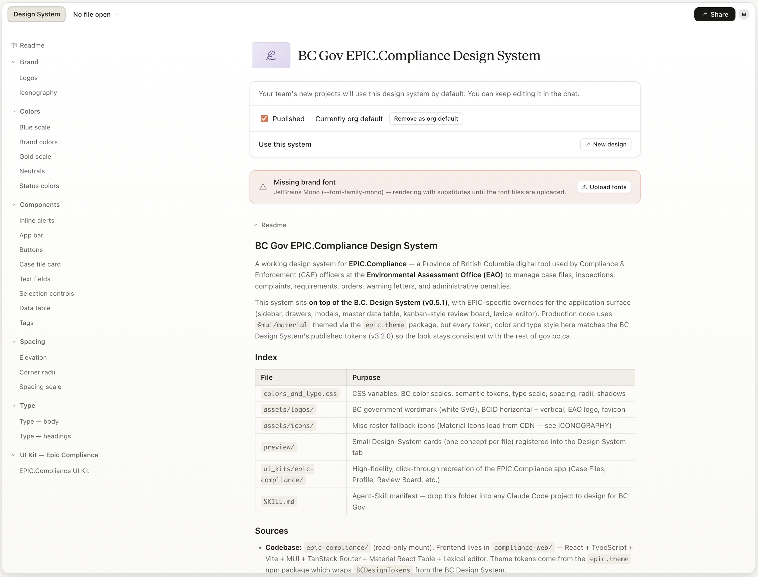
  • A published design system. I built one covering brand, colour scales, components, spacing and type, sitting on top of the BC Design System with tokens matched to the province's published set, so the tool looks like the rest of gov.bc.ca.

  • Access to the existing codebase. The prototype reused components already built for the office's compliance product rather than inventing new ones.

  • Figma connected directly. The tooling read the real frames, so design-side styles could carry into implementation instead of being rebuilt by hand.

  • A reusable skill manifest, so the whole setup can be dropped into another project and used to design for BC Gov.

The interesting problem is not getting AI to produce a screen. It is holding it to a design system.

Built on MapLibre, with the BC Data Catalogue for provincial layers, the BC Geocoder for place search, and 358 EAO project points with live phase and proponent metadata.
Published design system built on the BC Design System

A published design system built on the BC Design System, used to keep AI-generated designs on the province's own tokens and components.

Designs generated against the established component set

Ideating against the established component set.

The tool is only as good as what arrives

Analysing a real submission showed the structure problem underneath. One free-text comment field was carrying several different structured meanings at once, because none of them had a column of their own. The proponent had followed the rules every time. The schema simply had holes, and prose was filling them.

I validated the tool's area calculations against the proponent's own published figures. They agreed to within 0.1 to 0.2 per cent, which also set the rounding rule: at that margin, quoting a figure to two decimal places is false precision on a map that gets read as legal record.

Across further submissions the same pattern recurred. Mixed coordinate systems inside a single package. Files with no classification. No clean project boundary. One folder turned out to contain two entirely different projects about 150 kilometres apart, unlabelled.

The findings became schema and submission-guideline recommendations: fields proponents already produce, that simply never reach the data.

Comment one free-text field Which mine-life year the feature belongs to Which design alternative it is part of Watercourse and waterbody names A reference back to a figure in the application

Four meanings, one field. None of them had a column to go in, so all of them ended up in free text. The proponent followed the guidance every time.

Why it mattered. Several components appeared three or four times each, once per mine-life year. Selecting one returned all of them merged together, which reads as the maximum extent across the whole project life presented as though it were today. A confidently wrong answer, on a map that gets treated as legal record.

Nine sessions, run as “you are my hands”

The participant directs and I drive. It was the only way to get behavioural signal on a prototype that could not yet be handed over, and it kept the session about their reasoning rather than my demo.

I also pressure-tested my own reading against theirs, agreeing where the evidence supported it and pushing back where a “confirmed need” turned out to be a soft “sometimes”.

  1. 1

    Two roles named the same need, independently

    A project assessment officer and a regional engagement lead each raised the same capability unprompted: which First Nations intersect this footprint. That moved it from a niche request to the core job of the tool.

  2. 2

    Trust is the adoption lever, not features

    Real-time data and a visible “last updated” date came up in every single session. People will not act on a map they cannot date.

  3. 3

    It settled what the tool is for

    The tool does the common, self-serve work. The office’s GIS specialist keeps the custom and complex work. That had been an open question inside the office, and the sessions answered it.

What I changed, and why

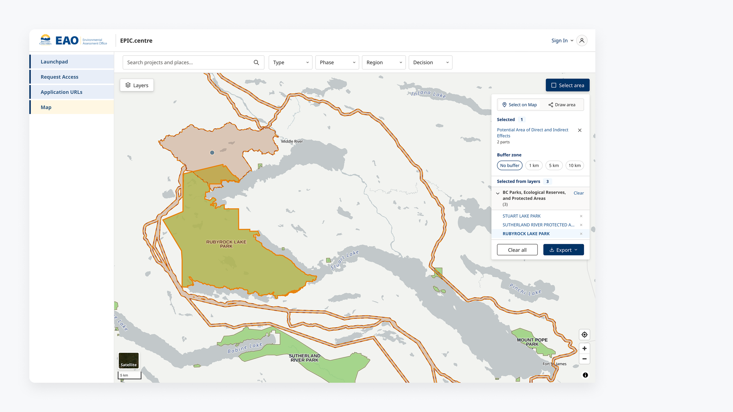
The first prototype let you draw a circle or a rectangle to select an area. Watching people use it showed that hardly anyone actually wanted to draw a shape. They drew shapes because there was no way to select the project footprint itself, which was what they were really after. The workaround had been in place long enough to look like a preference.

So I rebuilt that part of the tool:

  • Select on map took over from drawing a circle. You pick the footprint, or a single component within it, and work from the real submitted geometry instead of an approximation traced by hand.

  • A measurement tool, which had been the most requested thing in the survey and was not in the first build at all. People had been switching to Google Earth's ruler to get it.

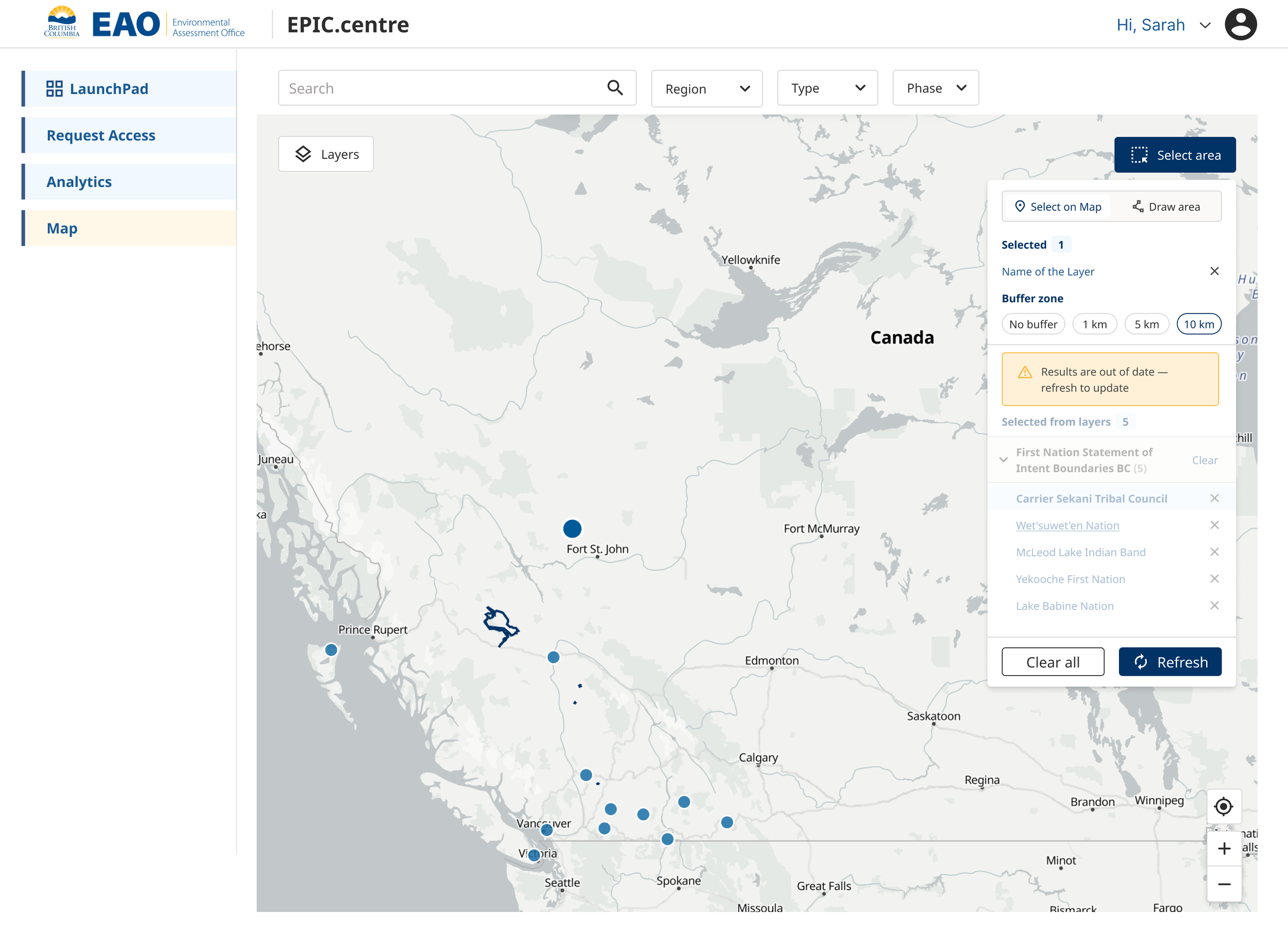
  • Buffering, so you can ask what falls within a set distance of the real footprint rather than guessing at a radius while you draw.

The difference is not convenience, it is accuracy. Draw a rectangle around a mine and ask what is inside it, and the answer is about your rectangle. Select the footprint and buffer it, and the answer is about the project.

Project footprint selected on the map, with intersecting protected areas listed

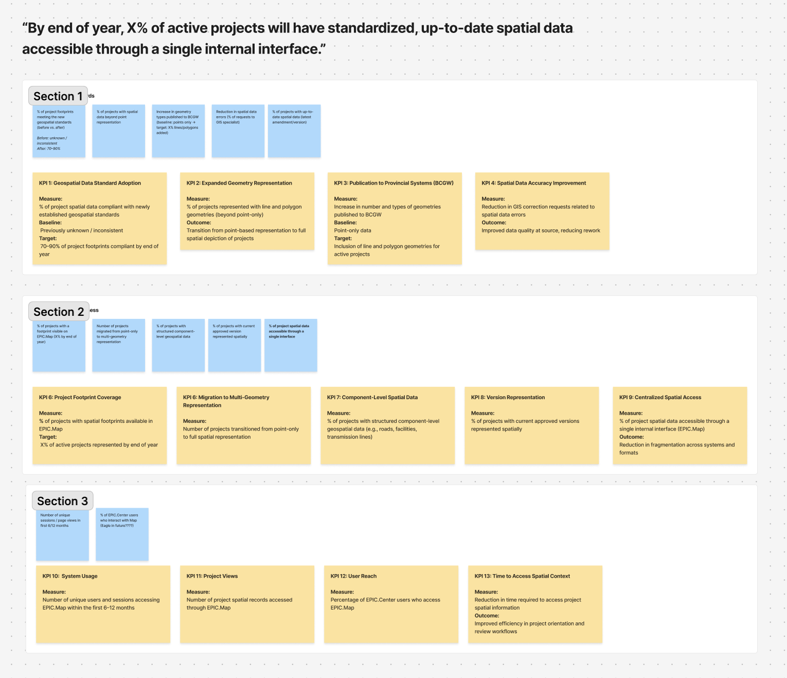
Measurement defined before launch

Each measure is tied to a baseline already captured in the staff survey, so the comparison exists before the tool ships rather than being reconstructed afterwards.

Self-serve rate

Share of staff who can get spatial information without asking a specialist or a colleague.

Time to locate spatial information

Baseline: of those who use spatial data, ten took thirty minutes or more to find what they needed.

Projects with real geometry

Share of projects represented by a footprint and components rather than a single point.

Ad-hoc map requests

Repetitive one-off requests to the GIS team, before and after launch.

Board defining KPIs against survey baselines

KPIs defined before launch, each tied to a baseline question in the staff survey.

Where it stands

The tool is pre-launch. What exists is a validated evidence base, a working prototype that has already redirected who the product is for, a measurement framework with baselines captured, and a documented set of open decisions: where the source of truth for project data should sit, how restricted layers get authenticated without putting credentials in the front end, and what the office wants to own versus what it deliberately does not.

Saying which parts are proven and which are proposed is not a caveat. In a regulated context it is the whole job.